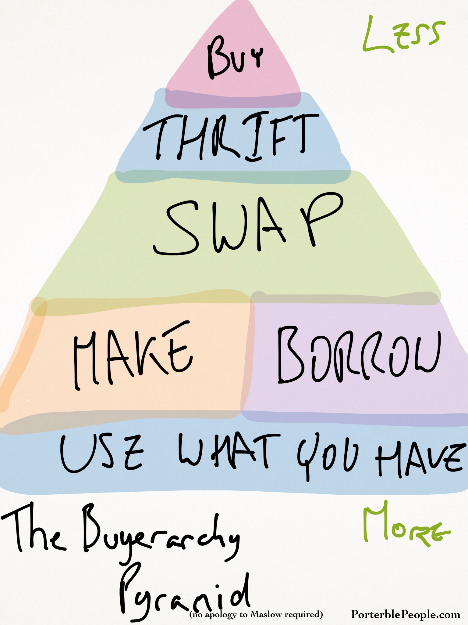
 Recently a friend shared an image that tried to visually highlight an ethical hierarchy using the now familiar Maslow’s hierarchy of needs. This usual pyramid highlights the broad lower levels of ‘use what you have’ and ‘borrow,’ ascending to narrower upper levels culminating in ‘Buy’ and ostensibly imploring the viewer to buy less and ethically source more. However, there is a significant problem with this hierarchy as it stands, and it stems from the source material.
Maslow’s hierarchy is used to designate the base level requirements—the ‘needs’—of an individual to find fulfilment, culminating in their personal ’self-actualisation.’ Each lower category in the hierarchy is a pre-requisite that needs to be fulfilled to achieve the next layer up.
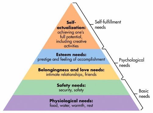
Which is why the plethora of modern interpretations that include ‘wifi’ as the base level (https://www.google.com.au/search?q=maslows+hierarchy+wifi) are so easily able to be understood as indicating that life cannot continue without these basic pre-requisites.
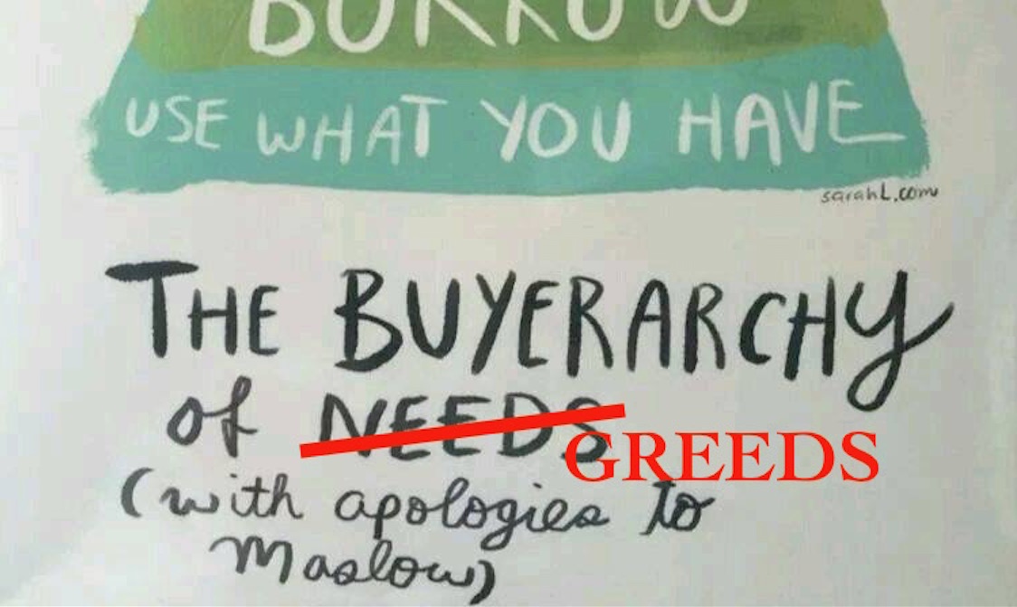
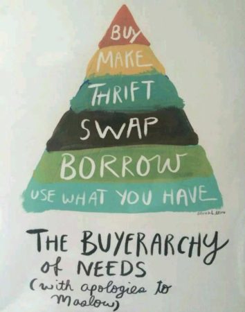
The problem for this ‘Buyerarchy of Needs’ is that by basing their paradigm on that of Maslow hierarchy they are implying that the ‘Buy’ state represents the goal of human needs, and that borrowing and using what you have are only pre-requisite steps on the way to buying. Patently this is the inverse of what they are attempting to communicate, and they need to revise their metaphor. Because in this configuration it communicates far more of a ‘Buyerarchy of Greed’ than an ethical buying guide.
I suspect that they have been confused with the other common hierarchy, that of the food pyramid, that is commonly represented in the same fashion.
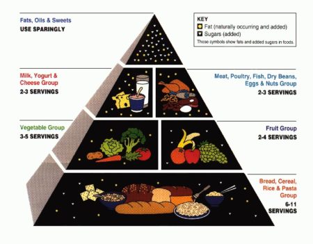
In this paradigm the upper levels are smaller to convey that one should consume less of these items, and this finds great parallels with the intentions of the ethical buying pyramid.
Ultimately this points to the need of choosing our analogies carefully, as a significant amount of our message relies on our audience’s prior understanding of the analogical source. In this case the use of Maslow’s hierarchy (likely because the author didn’t have a good grasp on Maslow) conveys a message completely opposite to the intention of the image. Choosing the right analogy here is critical as the wrong analogy will detract from the message—or undermine it at worst. Ultimately if a point is so severely undermined by the analogical presentation then either choose another analogy or don’t make the point at all.
To end this on a positive note, here is likely what they were intending, with no apology to Maslow required: